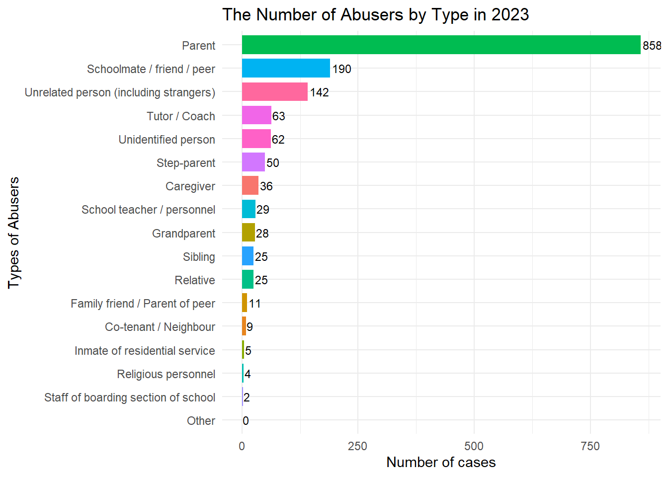
Bar Chart: The Number of Abusers by Type in the Most Recent Year (2023)
PS: To present a chart type different from the above, this one visualizes the case numbers rather than the percentages.
plot5 <- df_clean |>filter(system =="CPR"& category =="Perpetrator's Relationship with Maltreated Child"& year ==2023) |>group_by(item) |>ggplot(aes(x =fct_reorder(item, cases), y = cases, fill = item)) +geom_col(width =0.8) +geom_text(aes(label =round(cases)), hjust =-0.1, size =3) +coord_flip() +labs(title ="The Number of Abusers by Type in 2023",x ="Types of Abusers",y ="Number of cases") +theme_minimal() +theme(legend.position ="none")print(plot5)